Download source
In this post we will discuss:
- How to make a user control.
- Binding data.
- Create an event handler
User controls are a kind of organization of the code, that helps you in reusing your code and also encapsulating some logic and user interface objects.
———————————————————
How to make a user control
User Controls are manly an UI elements, so the design is a main factor in making it.
Regardless of your experience or any programming limitations, start any designing tool and start working on the user experiences of your new control.
Out Target is to make Page like this:
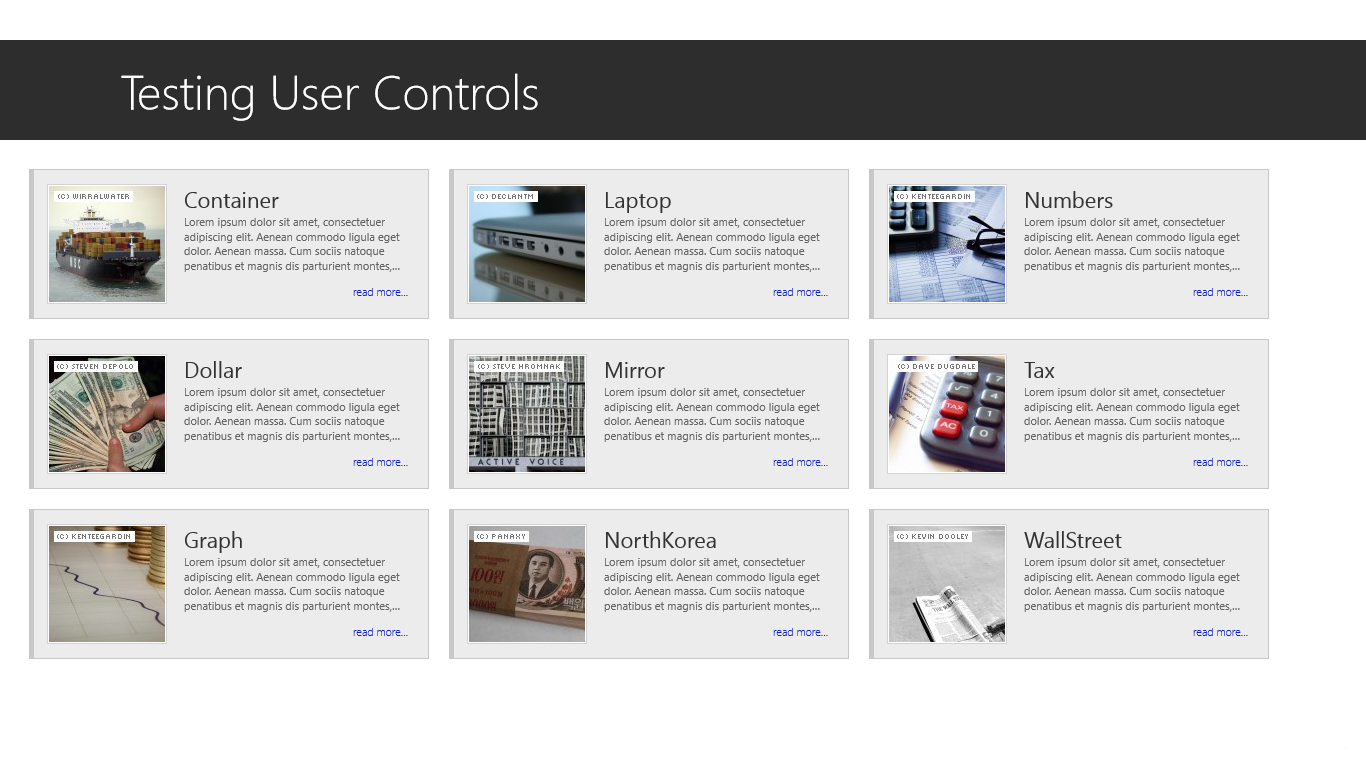
Along this post I’ll talk and apply on a simple “Card” contains [Image – Title – Some text – read more link].
Using my Designing tool, i think this is what my new card control will looks like:

Now it’s coding time 😀
Start your Visual Studio 2012 and open your project or create new one.
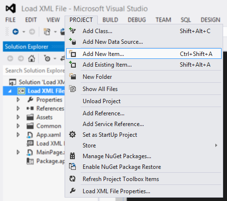
Step 1.0: Add a new item “User Control”
right click on you project > add > New Item.

Step1.1: Select “User Control” and chose a appropriate name.

Now you new 2 files in you project, one for the design .xaml and another for logic and programming UI .xaml.cs
In .xaml file lets start applying the design initially it contains this few lines:
<UserControl
    x:Class="User_Control.CardControl"
    xmlns="http://schemas.microsoft.com/winfx/2006/xaml/presentation"
    xmlns:x="http://schemas.microsoft.com/winfx/2006/xaml"
    xmlns:d="http://schemas.microsoft.com/expression/blend/2008"
    xmlns:local="using:User_Control"
    xmlns:mc="http://schemas.openxmlformats..."
    d:DesignHeight="400"
    d:DesignWidth="600"
    mc:Ignorable="d">

</UserControl>
Step 2: we need to add an container that hold all our UI elements
with dimensions 400 * 150 and separated horizontally into 2 columns “Image and Text”
<Grid
    Width="400"
    Height="150"
    Margin="5">
    <Grid.ColumnDefinitions>
        <ColumnDefinition Width="150" />
        <ColumnDefinition Width="*" />
    </Grid.ColumnDefinitions>

    <!-- Our XAML will be here -->

</Grid>
My control background is just a simple control with a background color and a border Like this
<Border
    Grid.ColumnSpan="2"
    Background="#FFECECEC"
    BorderBrush="#FFC8C8C8"
    BorderThickness="5,1,1,1" />

Step 3: Image framed within double borders, so we need two more borders in the first column “Image Column” with the size of the image
<Border
    Width="120"
    Height="120"
    Margin="5,0,0,0"
    BorderBrush="LightGray"
    BorderThickness="1">
    <Border
        BorderBrush="White"
        BorderThickness="1">

        <!-- Image Will be Here -->

    </Border>
</Border>
Margins added to make the background spaces in the top, down and left equal
Step 4: Now we want to put the Image
<Image
    Source="{Binding ImagePath}"
    Stretch="None" />
lets talk about the image source and the binding later.
Now we made together this

Step 5: For the right column, I see we can separated it vertically into 3 rows
This is my implementation, another one may use a vertical instead, and the output will be almost the same.
1st row: with some Properties to fit the design.
2nd row: with some Properties to fit the design and limit the text length.
3rd row: with some Properties to fit the design.
<Grid
    Grid.Column="1"
    Margin="5,15,15,15">
    <Grid.RowDefinitions>
        <RowDefinition
            Height="30" />
        <RowDefinition Height="*" />
        <RowDefinition Height="25" />
    </Grid.RowDefinitions>

    <TextBlock
        Grid.Row="0"
        FontFamily="Segoe UI"
        FontSize="22"
        Foreground="#FF323232"
        Text="{Binding Title}" />

    <TextBlock
        Grid.Row="1"
        FontFamily="Segoe UI"
        FontSize="11"
        Foreground="#FF636363"
        Text="{Binding Content}"
        TextTrimming="WordEllipsis"
        TextWrapping="Wrap" />

    <HyperlinkButton
        Grid.Row="2"
        HorizontalAlignment="Right"
        VerticalAlignment="Center"
        Click="HyperClicked"
        Content="read more..."
        FontFamily="Segoe UI"
        FontSize="11"
        FontWeight="Light"
        Foreground="#FF1122CC"
        Padding="0" />
</Grid>
The result will be:

Binding data.
In order to use this “Card Control” we need to make its data dynamically filled, and the data binding will help in this point.
I’ll not discuss the data binding in this post, but I’ll tell you how to use it in your Control.
you need to create another class Holds one card data “CardData.cs” in my case it will contains this Properties:
- ImagePath: hold image name and path in Assets
- Title: Card Title
- Content: Text content of card.
- ID: card Number “Will be used later on event handling”.

binding all this Properties will be as normal Like this:
<Image
    Source="{Binding ImagePath}"
    Stretch="None" />
the different here is binding the “ID” we will use a specialized type of property called “Dependency properties”
In CardControl.xaml.cs
public string ID
{
    get
    {
        return (string)GetValue(Card_ID_Property);
    }
    set
    {
        SetValue(Card_ID_Property, value);
    }
}

public static readonly DependencyProperty Card_ID_Property =
    DependencyProperty.Register(
        "ID",
        typeof(string),
        typeof(CardControl),
        new PropertyMetadata(null));
Realted: Dependency Properties Overview
Using the User Control
In the Required page we will use the new “Card Control” Like this:
In .xaml file:
<GridView
    x:Name="UI_GView_Cards"
    ItemsSource="{Binding}"
    ScrollViewer.VerticalScrollBarVisibility="Hidden"
    SelectionMode="None">
    <GridView.ItemTemplate>
        <DataTemplate>
            <local:CardControl
                CardLinkPressed="CardControl_CardLinkPressed"
                ID="{Binding ID}"/>
        </DataTemplate>
    </GridView.ItemTemplate>
</GridView>
In the MainPage.xaml.cs file:
create List of type “CardData”.
Assign it to the GridView ItemsSource.
private IEnumerable Cards;
//Fill Cards with Data.
UI_GView_Cards.ItemsSource = Cards;
Related: Load XML file
Create an event handler
now this is the last step.
To create an event handler you need to:
- Define a delegate “describes the parameters that the event will pass”.
- Use this delegate in event definition “describes the event name which will appear in the events list”
public delegate void HyperlinkEventHandler(string ID);
public event HyperlinkEventHandler CardLinkPressed;
all what i need to do is to call my new event every time the clicked
// HyperLinkButton Click Event
private void HyperClicked(object sender, RoutedEventArgs e)
{
    CardLinkPressed(GetValue(Card_ID_Property).ToString());
}
and with a simple Logic, I can determine the action to be done every time the hyperLink clicked.
in MainPage.xaml.cs file:
private void CardControl_CardLinkPressed(string ID)
{
    foreach (CardData c in Cards)
    {
        if (c.ID == ID)
        {
            UI_TBlock_Title.Text = c.Title;
            UI_TBlock_Content.Text = c.Content;
            UI_Popup_Display.IsOpen = true;
            break;
        }
    }
}
In my testing application, it show the full card content in simple popup.

———————————–
Don’t Forget to leave a comment, and waiting for your opinions ☺


 Abdullah A. Hassan